Article
Stop using lorem ipsum in your designs
Successful (and usable) websites start with content first followed by design. But this doesn’t mean you can get away with using lorem ipsum filler text in place of realistic content.
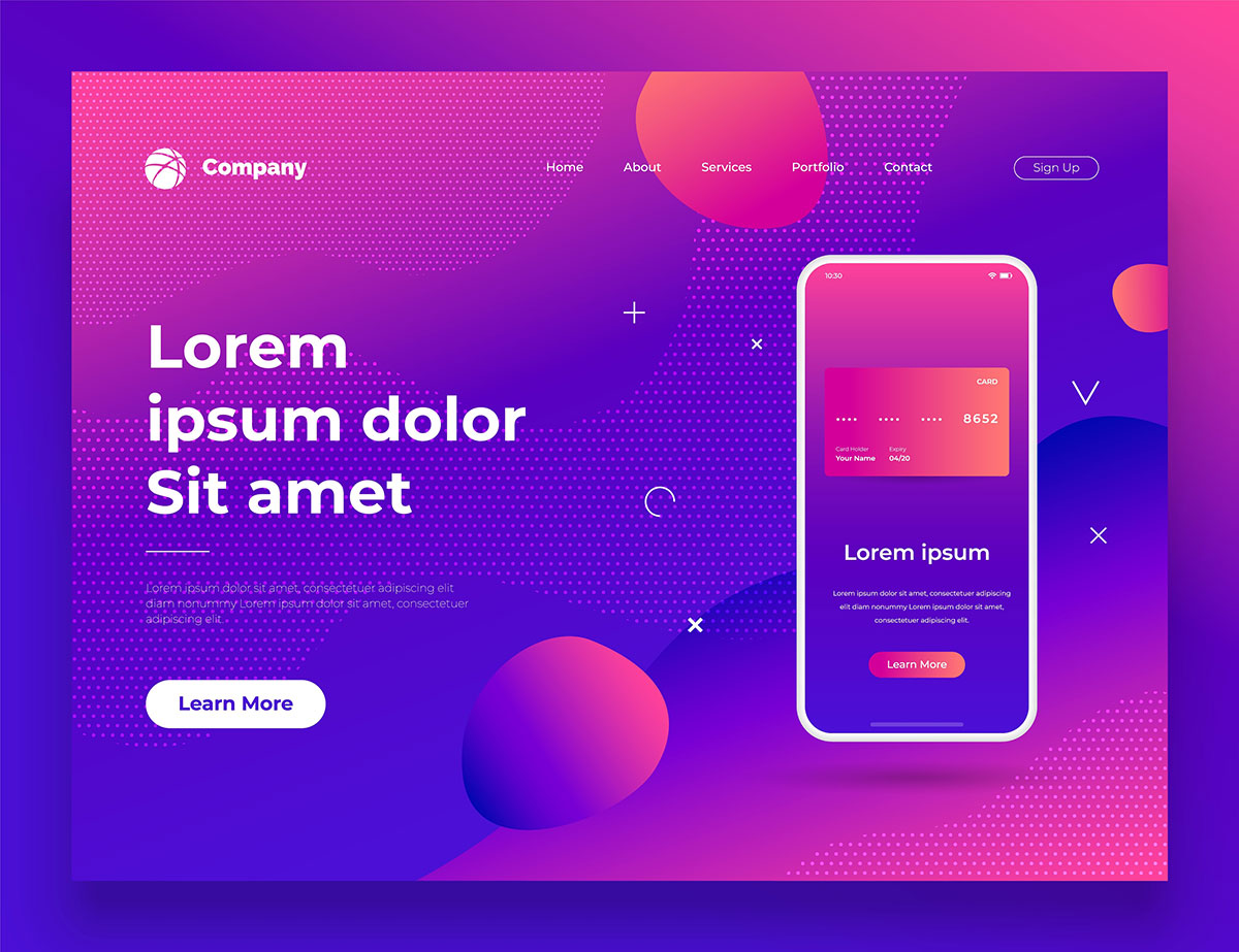
In a nutshell, the problem with using lorem ipsum text in UI/UX designs is that it reveals very little about the connection between the design and the content.
In this article, we’ll talk about the pitfalls of using lorem ipsum text in your design projects and explain why using real content is better. We’ll also take a look at how you can get started with designing without lorem ipsum.
The pitfalls of using lorem ipsum text in your designs

If you’re like most UI/UX designers, you’ve probably gotten away with using lorem ipsum text in your prototypes. It’s an easy way to represent where content will appear on the interface while showcasing an aesthetically pleasing design.
In the early stages of the design process, using lorem ipsum instead of realistic content might help you try out different design concepts quickly. However, while it’s okay to use lorem ipsum text in low-fidelity prototypes where you’re simply focusing on getting feedback on the interface’s layout and the font, it prohibits you from taking a content-first approach with your designs.
“Using dummy content or fake information in the web design process can result in products with unrealistic assumptions and potentially serious design flaws.” – Luke Wroblewski, Death to Lorem Ipsum
Sure, using lorem ipsum text as placeholder text in your designs may be convenient, but you’ll likely have to run several design iterations to get valuable feedback from clients and users. Let’s step through some of the main reasons why you shouldn’t use lorem ipsum text in your UI designs:
- Isn’t suitable for high-fidelity prototypes. Lorem ipsum text isn’t ideal for high-fidelity prototypes which might be presented to clients, stakeholders, or end users for review and feedback.
- You’re not able to focus on the layout. Designers often argue that using lorem ipsum allows them to focus on the layout. This approach is counter-intuitive because you’ll likely end up with an unrealistic design. It’s better to build your layout around your content instead of the other way around.
- Space issues. Many times, you’ll end up with design layouts that are unable to house the actual content in the same way. You’ll likely have to do a lot of redesigning and restructuring down the road.
- Makes usability testing difficult. It’s nearly impossible to run successful usability tests that will give you useful outcomes if you’re using lorem ipsum text in your prototypes.
Using realistic content in your UI/UX designs will undoubtedly take more effort in the beginning, but it will pay off better than using lorem ipsum text.
Why real content is better
By using realistic content in your UI/UX designs from the outset, you’ll be able to deliver better designs in an optimal number of design iterations.
So, instead of designing with lorem ipsum content first to get feedback on the layout and then having to change that layout down the line because it didn’t go well with real content, you can start with real content.
You’re able to take a content-first approach
Adopting a content-first design approach will help you create usable designs faster. Why? Because realistic content provides context and allows you to build a cohesive design.
Content evokes emotion that leads to good design. But when you use lorem ipsum text, you’ll end up with a design that’ll feel disconnected once you replace the filler content with real content.
Taking a content-first approach doesn’t mean that you should finalize the content before beginning on the design. It simply means that you should have the content thought out – the content-first approach is an evolutionary process. A first draft will give your design team an idea of the message they need to communicate.
You can get valuable feedback from clients and stakeholders
Getting valuable feedback from clients and end users helps you build usable products and gain insight into how you can deliver better user experiences.
With lorem ipsum text, clients and end users won’t be able to see much past the design’s layout. Keep in mind that the experience your clients will get from seeing a prototype with lorem ipsum text versus seeing one with real content will, in most cases, be significantly different.
Lorem ipsum-based prototypes and mockups are usually less prone to changes than those that feature real content. This is because, as we mentioned before, content evokes emotion that lorem ipsum simply can’t.
You’ll get better usability test results
Usability testing is critical to designing user-centered products. Using real content in your UI/UX designs and task scenarios helps you get thoughtful feedback from test participants.
User interfaces with simple layouts and realistic content will give you more useful outcomes from usability studies than well-designed layouts with lorem ipsum filler text.
Designing without lorem ipsum
Though designing without lorem ipsum certainly takes more time and requires effort on both your and your client’s part, it’s definitely worth it in the long run. Here’s how you can effectively eliminate the need for using lorem ipsum in your design process:
Step #1: Get real content and examples
Ask clients for the content you’ll need to add to the project’s interface before you begin designing. Doing so will help you get an idea of the kind of content your client would like to see in the application, and you’ll be able to move forward with a content-first design approach.
For example, if you’re designing a food ordering app, you might ask your client to give you some sample restaurant names, copy, call to actions, addresses, error messages, etc.
By doing so, you can ensure that you won’t have to redesign or restructure the interface’s layout drastically as you move from mockups to prototypes to the final product. In addition to this, you’ll be able to rest assured that the actual data your client wants to see will fit into the interface’s layout without overlapping.
Tools like Content Snare make it easy for designers to ask clients for content by creating requests and specifying due dates.
Step #2: maintain consistency in user flows
Once you’ve recieved the sample data from your clients, you’ll want to make sure you’re using the same dataset throughout your application. Following our food ordering website example, if you’ve used a restaurant’s name in the Choose a Restaurant screen, use one of the same restaurant names in the Checkout screen, as well.
Doing so allows you to maintain consistency and design cohesive user flows. Also, you’ll be able to gather better, more useful feedback from usability tests when the time comes.
Step #3: Test all possible scenarios and edge cases
As a designer, you should identify and test all possible scenarios and edge cases whenever possible. To make this easier, ask clients for as much sample data as possible so that you’re able to brainstorm all possible scenarios.
For instance, if the client gives you a list of restaurant names (with the shortest name being four letters and the longest name being 20 letters), you’ll be able to preemptively make sure your interface’s layout can accommodate variable text lengths.
Conclusion
By using lorem ipsum text in your prototypes and designs, you’re essentially making content secondary and passing up the opportunity to gather feedback on a more realistic portrayal of your design.
Unless your goal is to speed through several design concepts, using lorem ipsum is a waste of time because you’ll eventually have to replace the filler content with actual content.
Have you had to go back and make major design changes because of using lorem ipsum in your prototypes or designs? Let us know by commenting below.


