 Article
5 Mistakes to avoid when writing task scenarios for usability testing
Writing task scenarios for usability testing that accurately reflect user goals can be pretty difficult. Ideally, you want to come up with tasks that are realistic, actionable, and don’t give away obvious clues.
Task scenarios have a direct impact on the outcome of your usability studies. If you give test participants poor task scenarios, you could bias them towards taking a specific action rather than what they would actually do if they were in a similar, real-world situation. As a result, your findings and insights would be less useful.
In this article, we’ll discuss some common mistakes UI/UX designers should avoid when writing task scenarios. By doing so, they’ll write better task scenarios and improve the outcome of usability testing in their projects.
Mistake #1: Telling users where to go and what to do
Task scenarios are kind of like problem statements in that they provide context for why the user is about to interact with the application. Essentially they help the user pretend they’re in a real scenario and need to interact with the application to perform a task.
If you use words from your interface’s microcopy as-is in task scenarios, you’re essentially telling test participants exactly which steps they need to take to complete the task successfully. Rather than testing to see if your navigation labels are meaningful, you’re testing the participant’s ability to match words.
Instead, create task scenarios that don’t contain the words you used in your interface. Let’s take a look at an example.
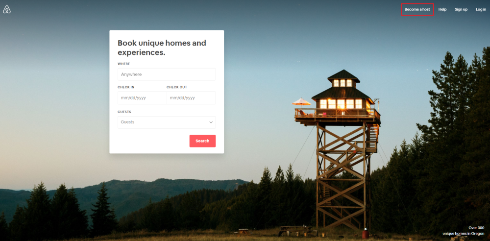
User goal: Become a host on Airbnb.
Poor task scenario: You want to list your three-bedroom apartment on Airbnb. Go to airbnb.com and become a host.
Good task scenario: Use Airbnb to list your three-bedroom apartment for rent.
Many times, users will need to complete a series of steps in order to complete a task. When you’re testing your prototype’s usability for these tasks, make sure you’re not telling the participant exactly where to go by dropping helpful hints.
User goal: Buy tickets for the event.
Poor task scenario: You want to attend the INBOUND 2019 event. Go to the website, register for the event, select a pass, purchase one ticket, and pay using a credit card.
Good task scenario: Purchase a ticket for the INBOUND 2019 event.
Mistake #2: Using random or dummy data in your task scenarios
Using dummy data (like lorem ipsum text) in your task scenarios or prototypes can make it difficult for the test participant to complete a task and bias the results of your usability tests.
For example, if you were testing the usability of a website that requires users to fill out a form, you’d want the test participant to fill out the different fields using fake data that resembles accurate information instead of entering random text.
So, if the form asked for the user’s email address twice, the test participant might be frustrated entering it the second time, and you’d be able to observe their frustration. However, if the participant was using dummy data (e.g., entering aaa in place of an actual email address) filling out two form fields wouldn’t be as frustrating and might go unnoticed.
You might even consider telling the participant which fake data they should use in the task scenario.
User goal: Fill out the guest checkout form.
Poor task scenario: You’ve added products to your shopping cart and need to complete your purchase as a guest user.
Good task scenario: You’ve added products to your shopping cart and need to complete your purchase as a guest user. Use the billing address House 120 Pike Street 90010 where applicable.
Designers use lorem ipsum in their prototypes when the original copy isn’t available. The problem is that the client and the designer both know the purpose of the interface whereas the test participant most likely doesn’t.
If you use lorem ipsum text in place of copy that’s supposed to guide the user towards a particular action, the user might hesitate to perform the task due to the lack of information. Making this mistake almost always results in inaccurate findings.
Mistake #3: Creating tasks that are too simple or too elaborate
If task scenarios are too simple, you won’t be able to get the insight you need to improve your product. And if task scenarios are too elaborate, there’s a chance that the participant will get confused.
You want to use the Goldilocks Rule and create task scenarios that are neither too simple nor too elaborate.
A common mistake designers make is writing task scenarios that simply require the test participant to navigate through the site. Creating realistic tasks that make test participants interact with your application beyond finding some information will help you get a better understanding of which areas need improvement.
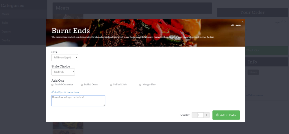
User goal: Re-order a past order.
Poor task scenario: You ordered a delicious half pound brisket sandwich from Mighty Quinn’s Barbeque yesterday. Use the website to order it again.
Good task scenario: You ordered a delicious brisket sandwich from Mighty Quinn’s Barbeque yesterday. Use the website to order it again but make it a full pound and ask them to draw a dragon on the box.
Writing wordy task scenarios just for the sake of providing context can lead to elaborate scenarios that might confuse the test participant. Once you’ve drafted a task scenario, read through it a few times to make sure you’re not providing any unnecessary details.
User goal: Adding a payment method.
Poor task scenario: You’ve been having trouble with your credit card and had to switch to a different one. Add your new credit card information to your account.
Good task scenario: You recently changed credit cards. Add your new credit card information to your account.
Mistake #4: Using marketing phrases
When writing task scenarios, you shouldn’t use marketing language or industry jargon to establish context or formulate the task. Doing so makes the wording come across as product-centric rather than human-centric.
User goal: Respond to messages quickly.
Poor task scenario: Leverage the brand new emoji reactions to vote and share your opinion on messages.
Good task scenario: Respond to messages using emojis.
If you’re conducting tests with a specialized audience, you can (and, in some cases, should) use technical terms in your task scenarios – especially if it’s in line with the application’s intended user base.
Mistake #5: Risking emotional reactions from participants
Mentioning specific relationships or creating task scenarios around a relationship might trigger an emotional reaction from test participants. For instance, creating a task scenario involving the user’s mother or aunt might seem safe, but it could elicit an unwanted response from the participant if they have a difficult relationship with the subject matter.
User goal: Using product filters.
Poor task scenario: Mother’s Day is around the corner, and you want to find a bouquet of pink carnations to send to her.
Good task scenario: Send your colleague a bouquet of yellow roses to celebrate her promotion.
Conclusion
Once you’ve determined what the end user’s goals are, you can come up with task scenarios for your prototype that will help you get the most accurate and most useful findings from usability studies.
Let’s recap the most common mistakes UI/UX designers make when writing task scenarios for usability testing and how to overcome them:
- Instead of telling users exactly where to go and what to do, use wording that doesn’t appear in your microcopy.
- You won’t be able to gather useful findings by using random or dummy data in your task scenarios or prototypes.
- Creating tasks that are too simple or too elaborate won’t help you improve your interface’s design and could potentially be confusing for the test participant.
- Using marketing phrases might make your task scenarios come across as product-centric instead of human-centric.
- Making references to personal relationships could risk an emotional reaction from the test participant. Instead, make the subject matter a friend or colleague.
Have you made any of these mistakes when writing task scenarios for usability tests? Share your experience in the comments section below.


