 Article
How to build a UI design system
A design system is a collection of repeatable, reusable components and guidelines that explains how to use each of those components. By utilizing design systems, creative agencies can speed up the design process, eliminate inconsistency in their designs, and minimize design entropy.
Design systems enable autonomous teams to:
- Interpret and understand the design decisions that went into creating the design system.
- Understand which direction to go to design, realize, and develop a website, web app, or product.
- Increase efficiency at scale by putting standards in place.
Let’s take a closer look at what design systems are and why you need them.
We’ll also look at some examples of design systems and show you how you can build your own.
What is a design system?
A design system is a collection of guidelines, principles, and assets that are relevant to a business. The purpose behind it is to help cross-departmental teams reinforce a consistent brand image in the products, websites, and web apps they create. It defines everything from how a business’ site looks to how they communicate with their audience and customers.
“A design system is a living, funded product with a roadmap and backlog, serving an ecosystem.” – Nathan Curtis, EightShapes
Here are some elements that are, generally speaking, common to design systems:
- Style and design guidelines. This includes icons, typography, colors, spacing, illustrations, and much more.
- UI/Pattern/Component libraries. UI libraries (also called pattern libraries or component libraries) include form design elements, images, navigation, overlays, and other UI elements.
- Content style guidelines. These are non-aesthetic elements that describe the project’s voice and tone, language, principles and objectives, and more.
A design system isn’t just about aesthetics. It includes both tangible and intangible artifacts like style guides, visual language, pattern libraries, brand guidelines, voice and tone, shared beliefs, implementation methods, and design language. Design systems, which are built into the product and the product development process, demonstrate what to do and what not to do.
Examples of design systems
Let’s take a look at some design systems created by big name brands.
Atlassian
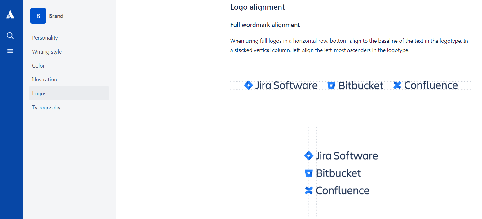
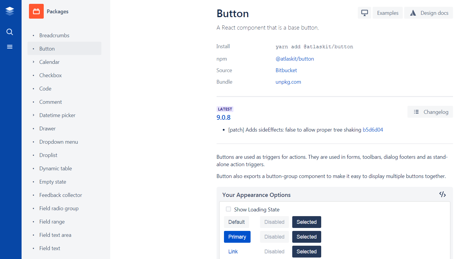
Atlassian’s design system consists of five main sections – brand, marketing, product, voice and tone, and Atlaskit. Atlaskit is the official UI library that includes components and APIs, design guidelines, and a developer blog.
Salesforce
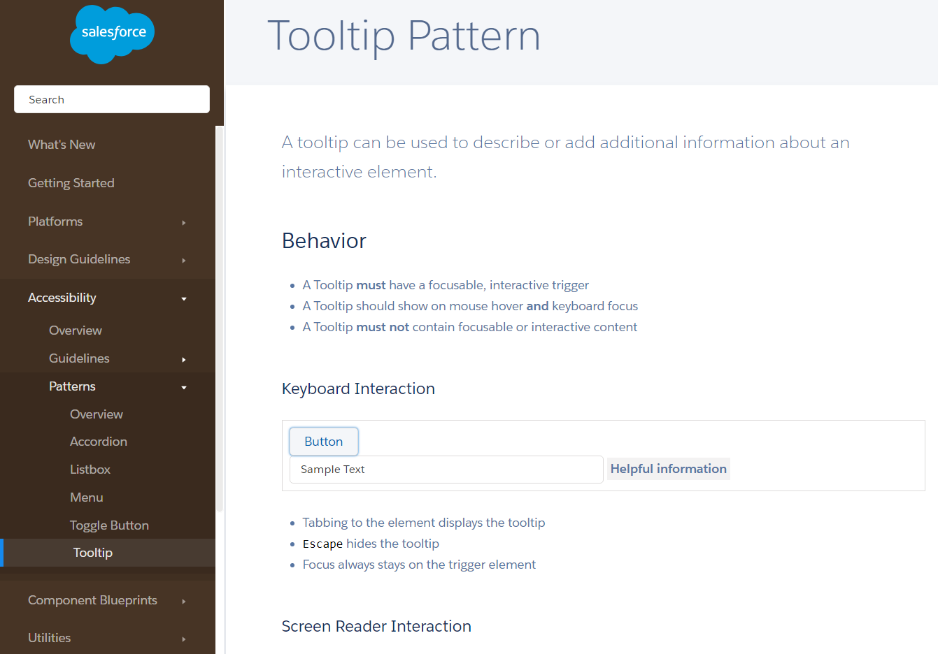
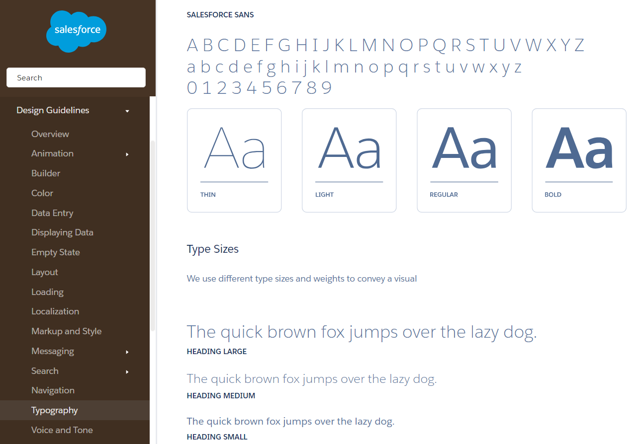
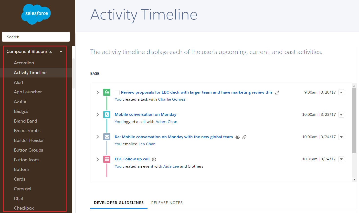
Salesforce’s design system is divided into design guidelines, accessibility, component blueprints, utilities, design tokens and icons. It’s an incredibly comprehensive design system that explains everything from animation timing, effects, and dimensions to the accessibility of a tooltip.

Google’s design system is neatly split into three main sections – design, develop and tools. The design section contains detailed design guidelines that cover layout, color, typography, iconography, and much more. The develop section contains resources for building products for iOS, Android, web, and Flutter. And, finally, the tools section includes collaborative tools like Material Theme Editor that both designers and developers can use to simplify their workflow.
Shopify
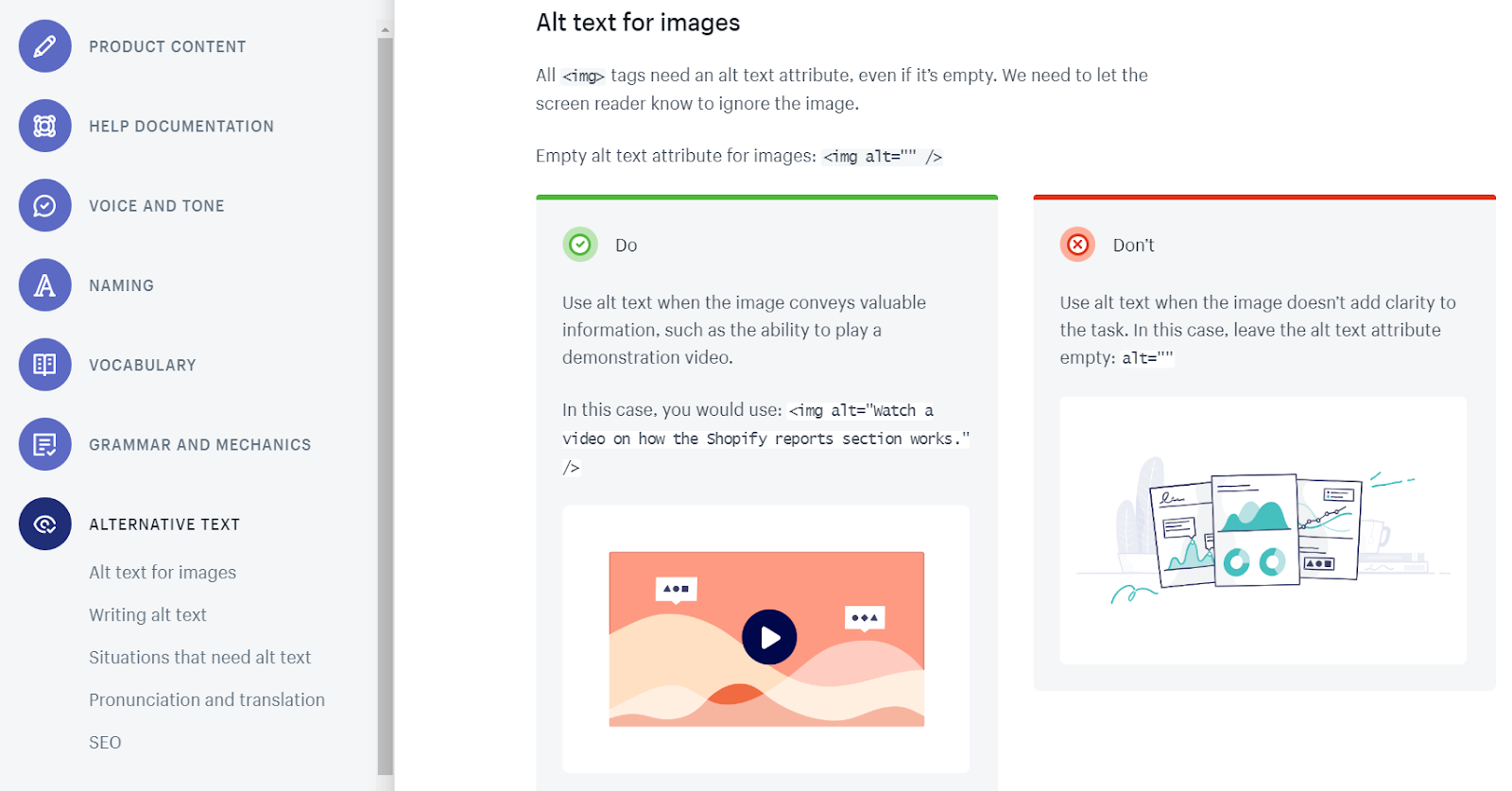
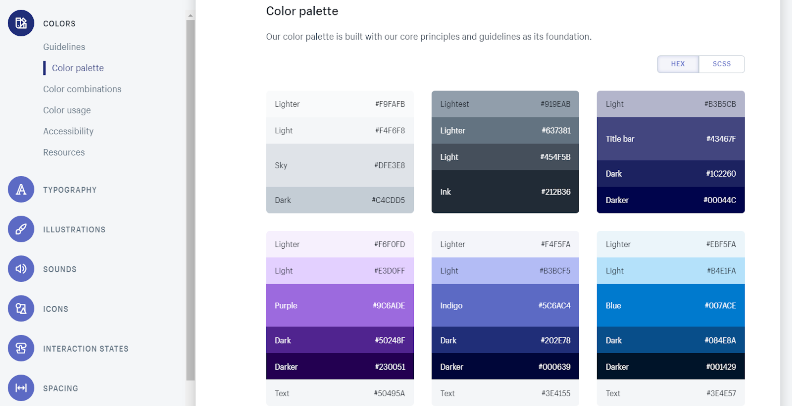
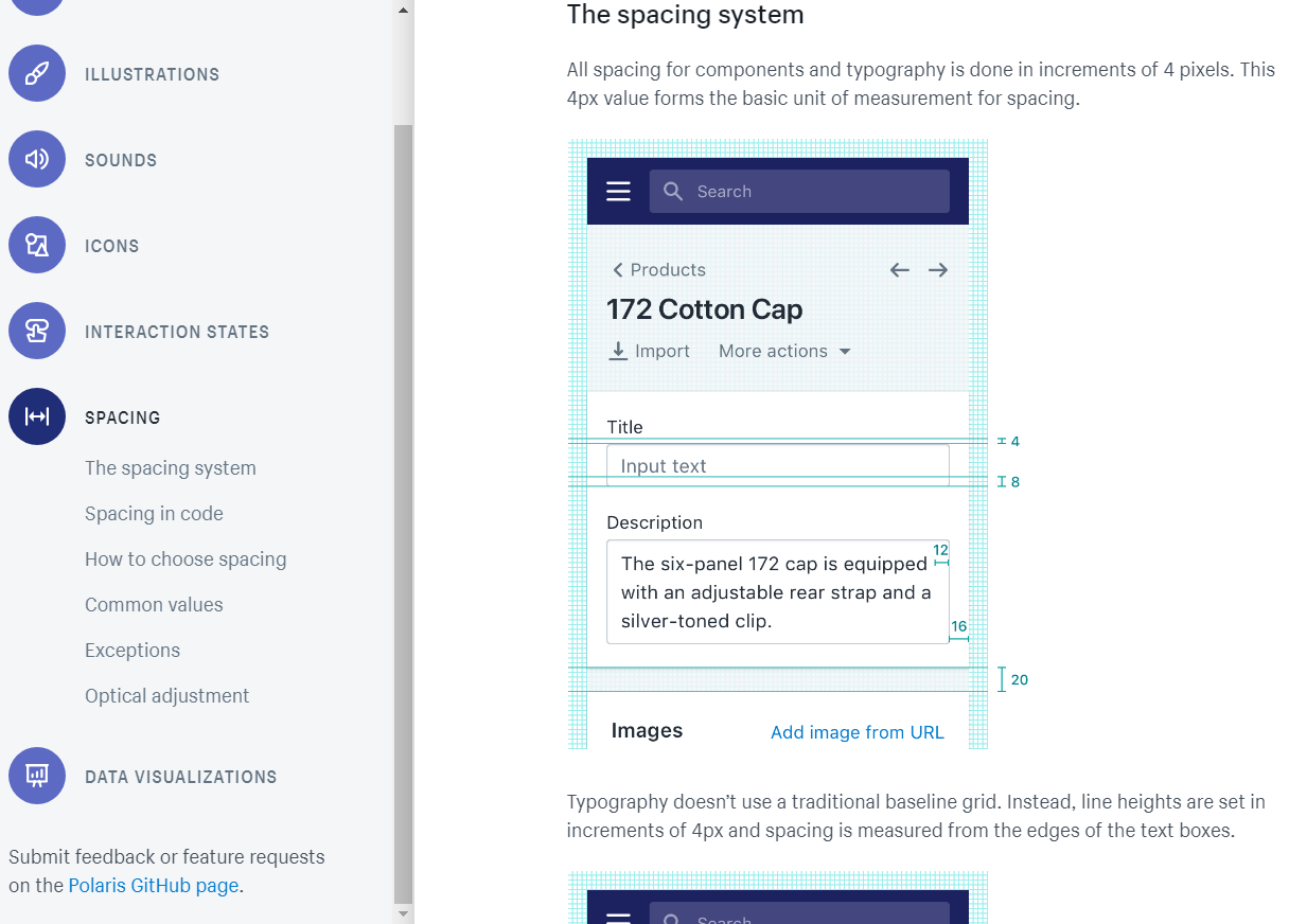
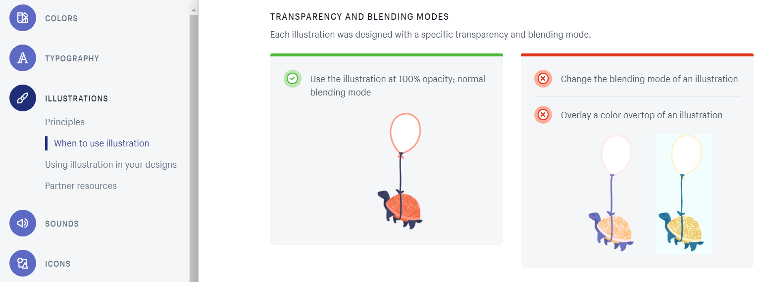
Shopify’s design system is a collection of content, design, components, and patterns. In addition to this, it also has a guides section that talks about the company’s principles and brand value.
Why you need a design system
Design systems bring many tangible benefits to the table.
They enforce visual and interaction consistency allowing web design teams to focus on bigger problems instead of sweating the small stuff. And since everyone on the team is on the same page, the end product remains consistent throughout the design process.
Design systems help design teams deliver better and familiar user experiences. Instead of designing from scratch, you’re able to use what already works.
Design systems are living documents, which simply means that they’re continually maintained and updated. They grow dynamically with the agency of record and the projects they’re built to support. In this way, design systems reduce design debt.
How to create your own design system
Although there isn’t a one-size-fits-all solution when it comes to building design systems, let’s take a look at what you would need to do to get started with a step in the right direction.
It’s important to keep in mind that not all design systems are built the same. Some design systems include sections that another design system might choose to leave out. Base your design system on the objectives of your project.
With this in mind, here are a few guidelines that you can follow to build your own design system:
Step #1: Conduct a visual audit
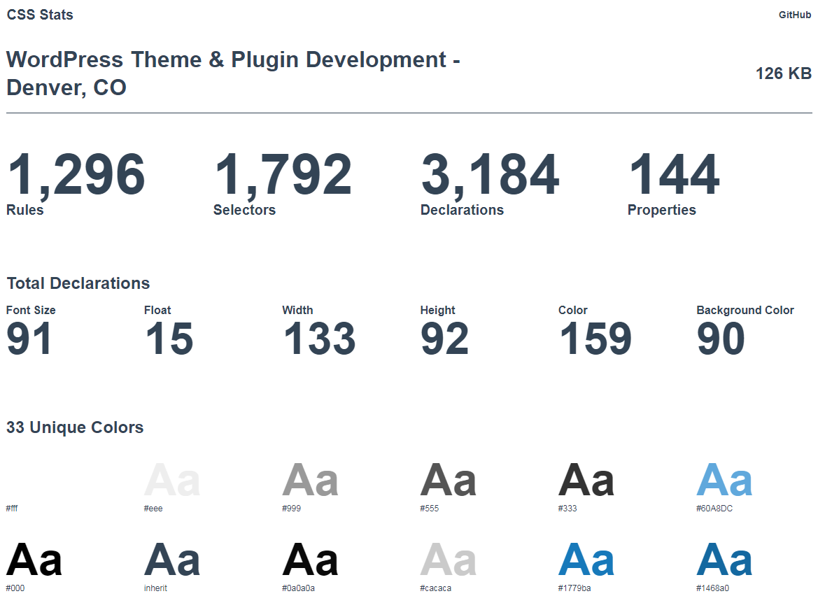
When you’re building for a website (or product) that already exists, the first thing you need to do is conduct a visual audit of your existing design. Take inventory of the CSS you’ve used to create the elements in your visual inventory using a tool like CSS Stats.
This tool lets you see how many rules, selectors, declarations, and properties you’ve used in your stylesheets. You can also use it to determine the different colors, font families, and font sizes you’ve used. In addition to this, it also gives you a graphical representation for spacing and sizing values. This makes it easy to see which elements can be merged or removed from your design system.
Step #2: Build a visual design language
The visual design language is the heart of any design system. It comprises the distinct components that your design team will use to build websites, web apps or products. For this article, we’ll explore four of the most widely used categories – color, typography, spacing and imagery.
Color
Start off by identifying and defining one to three primary colors that represent your brand. Design systems give you the flexibility to go deeper and create sub-sections (tints, shades, overlays) and use cases (what color combination to use on light backgrounds versus dark backgrounds).
Typography
In this section, you’ll define the various font families, font sizes, and other typographic rules you’ve decided to use for the project. It’s a good idea to keep the number of fonts low to prevent inevitable performance issues and inconsistency.
Spacing and sizing
Developing a system for spacing and sizing is all about using numbers based on patterns and proportions. For example, 4-based scales are becoming increasingly popular. Operating systems (like iOS and Android) and web browsers use a 4-based scale. Using a standardized system ensures that elements are more likely to fit together and align better.
Imagery
Set guidelines for using photos, illustrations, icons, and diagrams in your designs. For instance, will the icons be outlined or filled? Will they be monochromatic? When and where should you be using illustrations? Depending on the different types of imagery you’ve decided to use, you might consider defining rules for which file format to use in which situation.
Depending on your specific needs, you might consider including additional categories (such as motion or sound) in your visual design language to standardize the user experience.
Step #3: Create a UI/Pattern library
Create a UI inventory by opening up all of the projects and websites you’re currently working on and getting everything onto a centralized platform. One way to do this is by taking screenshots of the UI components.
Taking this step will give you an idea of which UI elements are used the most and help you visualize design debt. Do this for all of your UI elements – buttons, cards, lists, forms, etc. The goal is to work with your design team to gather and categorize all of the components you’re using in the project.
Next, divide the different UI elements into categories such as elements, components, regions and layouts. Finally, merge and remove everything you don’t need.
Step #4: Document every component
Document everything in your design system by defining what the component is and when you should use it. For instance, each component’s documentation might consist of:
- The component’s name/identifier
- A brief description
- Guidelines on when to use it
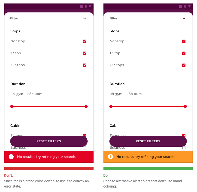
- Example of what to do
- Example of what not to do
- Code
You can go as in-depth with the documentation as you’d like. The goal is to create something that anyone on your team could use to get work done. Cupper is a documentation builder for designers that you can use to get started.
Conclusion
A design system is a living, breathing document that changes based on the business’ needs, objectives and direction. Building a design system is an iterative, collaborative process that combines research, UI design, development and management.
Let’s recap the main steps you need to take to build a design system:
- Conduct a visual audit by taking inventory of the CSS you’ve used in your project.
- Build a visual design language that details the colors, typography, spacing, and imagery used in your project.
- Gather all of the UI components you’re using to create a UI/pattern library and sift out the elements you don’t need.
- Document every component by defining what it is and when to use it.
What are some of your favorite design systems and what do you like about them? Share your thoughts in the comments section below.


